
Guide to heatmap analytics
Website analytics tools are great at compiling large volumes of data into an aggregate overview of site activity. Web analytics provide you with general metrics about how users move through your site. But they’re limited when it comes to helping you understand exactly how these users engage and interact with individual web pages. Using heatmap analytics fills that gap.
In this guide, you’ll learn:
- What heatmaps are
- How heatmaps work
- Benefits of using heatmap analytics
- Limitations of heatmaps
- How to combine heatmaps with other analytics tools
What are heatmaps?
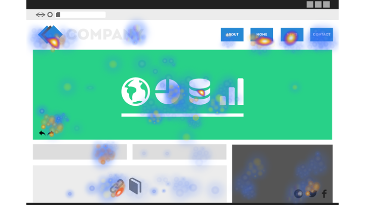
Heatmaps are a highly visual way to represent data points. They rely on a color code to highlight hotspots of user activity. Typically, these colors will range from blue (low user activity) to red (high user activity).
When it comes to analyzing a website, a heatmap typically takes the form of a semi-transparent overlay mapped onto an individual web page. The colored areas of the heatmap tell you which elements of the page your users engage with the most and which tend to get scrolled past and ignored.
Heatmaps are useful for understanding whether your page elements like buttons and forms work as intended. A heatmap can also help you optimize on-site customer journeys by flagging web page areas that need improvement.
How do heatmap analytics work?
Heatmap analytics collect data about how users interact with a page: what they click, how far they scroll, and even where they place the mouse cursor. A heatmap records this data and turns it into a multi-colored map of the page that’s more easily digestible and more meaningful than the data points presented on their own.
There are three broad types of heatmaps.
Scroll maps
This is the most basic type of heatmap. Instead of showing engagement levels with many individual page elements, scroll maps simply reflect how far users scroll down a page.
A scroll map splits the page into large horizontal sections, starting with red at the top of the page, which every user is likely to see. The lower sections of the page then get progressively bluer, depending on the percentage of users who scroll down that far.
Scroll maps are great for analyzing the performance of your longer pages. They can also help you spot whether critical sections are placed close enough to the top for most users to see them.
Remember that sometimes a page will give users everything they need right at the top (e.g. a clear call-to-action button that takes them straight to the next step). A scroll map for such a page may well show a steep drop-off of visitors after the top section, but it’s not necessarily an indicator of bad performance. That’s why it’s important to supplement scroll maps with additional insights.
Click maps
Click maps are more detailed than scroll maps. They show the exact page elements that your users click. Elements with the most clicks will be red. Typically, these will include call-to-action buttons, navigation menus, embedded videos, and links.
Sometimes, a click map will show that users engage with an element that isn’t designed to be clickable, such as an image. This data can help you spot and eliminate distractions on the page, as well as further refine the user journey.
Click maps can also help you evaluate the importance of clickable elements. Maybe you have a primary call-to-action button you want users to engage with, but there’s a navigation menu item that receives more clicks. You’d want to consider what your users are really looking for and redesign the page accordingly.
Hover maps (or move maps)
At a first glance, hover maps look like click maps. They show you individual hot spots of user activity and larger areas of inactivity.
The crucial difference is that hover maps show where users place their mouse cursor, regardless of whether they actually click on an element or not. This uncovers useful subconscious user behavior, like how people read and scan your page before making a decision to engage with it. That’s because there’s a strong correlation between where people place the cursor and where they look on a page.
This kind of insight can help you design a better visual architecture for your landing pages and other key areas of the site.
Benefits of heatmap analytics
So, what exactly can heatmap analytics help you with?
Understand whether your site structure makes sense to your users
Heatmaps can uncover whether users navigate your site the way you planned. Do they notice the key elements or scroll right past them? Do they click on something they shouldn’t? Are they hovering around the page aimlessly, as if they’re struggling to locate a specific section?
Ideally, your users should find what they need quickly and move on to the next step without getting distracted. Heatmaps can reveal whether that really is the case. Analyzing this visual map for every important page will help you design a more consistent user journey across your site.
Use heatmap analytics for conversion rate optimization
Heatmap analytics can also supplement your conversion rate optimization strategy. Your web analytics will let you know how many people fail to complete a key goal, but heatmaps can show you why it happens.
Have you placed your conversion elements too low on the page, where many users don’t scroll? Does your call-to-action button blend in with the rest of your page, making it hard to spot? Do irrelevant links distract your visitors and take them to different sections of your site?
Heatmaps will give you answers to these questions and more, helping you optimize your pages to achieve your primary conversion goals.
Optimize pages for mobile
Even though many people now browse the web on a mobile device, website owners still don’t always design their content with smartphones in mind. A page that works perfectly on desktop may have hidden roadblocks when viewed by mobile users.
Maybe an important item in your navigation becomes less visible when hidden in a collapsed hamburger menu on mobile. Or there’s a pop-up that works fine with the desktop experience but makes engaging with an element impossible when viewed on a small screen.
A heatmap helps you identify these roadblocks, as well as giving you a better idea of how mobile users scroll and click around your page. This enables you further optimize your pages with the mobile experience in mind.
Limitations of heatmaps
As useful as heatmaps are, they do come with certain limitations.
Heatmaps aren’t always easy to interpret
Understanding a heatmap takes some skill. In the best-case scenario, you’ll quickly spot users clicking on an irrelevant element – that’s easy to address.
But what if many seemingly relevant elements are clicked? Is that a good thing or do you want to reduce clicks on some of those and prioritize others?
Does a scroll map that shows every user scrolling to the bottom mean it’s an engaging page? Or are they scrolling all the way because they can’t find what they need?
You shouldn’t rely on heatmaps alone to tell you the full story, so you’ll need additional insights to make them meaningful.
They may not work well with dynamic pages
If your page elements shift, collapse, and expand based on what the users do, heatmaps may run into issues. They’re built to aggregate common actions taken by all users, but that’s difficult to do if users see different versions of the same page.
In some cases, a page expanding to reveal more content may conflict with a heatmap script. In such a situation, your heatmap might not even track what the user clicks within that expanded section, which makes further analysis difficult.
As such, heatmaps are better at tracking pages or groups of pages where all the elements are fixed and appear in the same way for all users.
They may be difficult to reconcile across different devices
Users behave differently on a mobile device compared to a desktop. This can make it difficult to get a consistent picture from heatmaps generated for different users, even if they’re visiting the same page.
First, hover maps won’t tell the same story, since mobile users don’t move their fingers around the screen in the same way a desktop user will move a mouse cursor. In general, a heatmap can’t accurately detect people’s subconscious hesitation on mobile since there’s no cursor to track.
Second, pages will often not look the same on mobile: elements are stacked and certain areas are minimized or hidden. That means that reading a mobile heatmap can be a less straightforward exercise than analyzing a desktop one.
How to use heatmap analytics in combination with web analytics and A/B testing
Heatmap analytics work best when combined with other web analytics and testing tools.
In practice, it’s often best to start with your general web analytics tool to identify areas of the site that are underperforming or not working. Once you’ve zeroed in on those, you can run heatmap analytics to help you identify the reason for the poor performance. Used in this way, heatmaps can help you spot and eliminate obstacles for different website visitors. This helps you better optimize the pages to build out your user journey and achieve your website goals.
If you’re running an A/B test, heatmaps can also give you an early indication of how two versions of a page compare. Is the call-to-action button in your B version getting a lot more consideration according to a hover map? Then do fewer people end up clicking it? Is it perhaps easier to spot but has more confusing text? This type of data can supplement the conclusions you’ll get from the A/B test.
Wir beantworten Ihre Fragen gerne.
Die Zusammenarbeit mit einem neuen Technologiepartner ist eine wichtige Entscheidung. Wir sind hier, um alle Fragen zu beantworten, die Sie haben.
Beratungstermin vereinbaren