
Creating accessible content is vital for reaching everyone and strengthening your brand. This checklist outlines five common web accessibility pitfalls and how you, as a content creator, can address them.
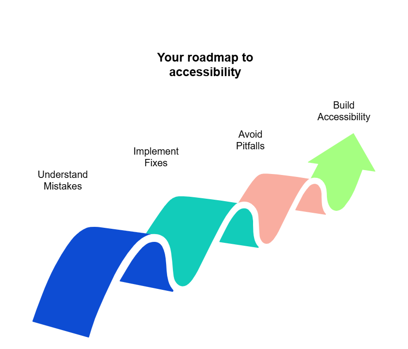
This is a great way to start with essential fixes. But if you're ready to go beyond the basics and equip your team with a complete understanding of these web accessibility issues, our comprehensive guide, backed by Siteimprove data, is your next step.
Think of it as the full roadmap. Inside, you'll get:
- Deeper dives into why each of these five mistakes happens and their full impact on users
- Expanded, step-by-step instructions and code examples for implementing fixes
- Additional common pitfalls and advanced strategies not covered in this overview
- Practical advice to help you proactively build accessibility into your content workflow
Stop letting easily overlooked accessibility errors undermine your content's reach and impact. Take control and ensure everyone can engage with your valuable work.
Beyond automated checks: Commonly overlooked accessibility errors
Website accessibility is best thought of a critical, ongoing commitment to your audience. While automated accessibility checkers are a good starting point, here's the catch: They don't catch everything. Many errors are honest mistakes, typically subtle issues often caused by how content management systems work or simple misunderstandings, and these need a human eye to identify the root cause and decide the best fix.
So, why do these particular mistakes often go unnoticed? Large-scale reports on web accessibility typically rely on automated data, which is great for big-picture trends but often misses the context: the cause, the best fix, and the magnitude of the user impact.
The issues we're about to cover frequently fall into this blind spot. For you and your content team, the goal goes beyond technical compliance to creating a genuinely usable experience that avoids frustration for every user.
The insights in this article come from a unique place: Siteimprove's analysis of 31,881 real-world interactions. These aren't just automated flags. Each one represents a case where a customer questioned an automated check, and our accessibility consultants manually investigated to determine the true root cause and provide practical, tailored advice.
This process has given us a deep understanding of common accessibility problems and the most effective ways to solve them, especially those tricky issues automated tools alone report in a “cookie-cutter” way, omitting context.
Now, it’s time to think about the top five mistakes we've seen, distilled from this extensive experience, specifically for web content authors and developers — those of you with an intermediate grasp of HTML, CSS, and WCAG.
1. Empty links – The hidden problem
- The issue: These are invisible links in your website's code (e.g., <a></a>). They offer no useful information to users of assistive technologies like screen readers, — only confusion and noise. This often happens when linked text is deleted in a WYSIWYG editor, but the link tags themselves remain. In our analysis, we saw many cases where the “empty link” was a broken link, or clearly outdated and incorrect. This causes an especially confusing situation for the screen reader and keyboard-only users.
- Your fix:
- Identify: Use browser extensions like WAVE or check your accessibility reporting tools.
- Locate & remove: Switch to your CMS’s HTML or code view to find these empty <a> tags and delete them carefully.
- Team awareness: Remind your team to check for these after deleting linked text or making major edits in the CMS.
2. Using headings (H1-H6) for visual emphasis
- The issue: Using heading tags (H1, H2, H3, etc.) just to make text bigger or bolder, rather than to structure content, breaks the page outline. This makes it hard for screen reader users to navigate or understand the content's hierarchy.
- Your fix:
- Correct use: Employ heading tags only to create a logical structure for your content (like an outline).
- Styling: For visual emphasis (bigger text, boldness), use CSS classes. If you don't have these, ask your design or development team to create them. Avoid using heading tags for purely stylistic choices.
3. The "px" vs. "pt" font size & contrast trap
- The issue: WCAG defines "large text" (which can have a lower contrast requirement of 3:1) using points (pt), common in print. Web developers usually work in pixels (px). "Large text" is 18pt (which is 24px) or 14pt bold (roughly 18.67px bold). Using 18px text, for example, and assuming it meets the "large text" criteria for lower contrast is a common mistake; 18px text is not "large text" unless bold and typically needs a 4.5:1 contrast ratio.
- Your fix:
- Verify sizes: If applying the 3:1 contrast ratio for "large text," double-check the font size is genuinely 24px or larger (or ~18.67px bold or larger).
- Increase contrast or size: If text doesn't meet the "large text" pixel equivalent, either increase the font size to meet it or adjust text/background colors to achieve the standard 4.5:1 contrast ratio.
4. "Label in name" failures for links & buttons
- The issue: For voice control users and some screen reader users, the spoken command must match the accessible name of a control. If the visible label of a link (e.g., "Read more") doesn't match or isn't at the start of its accessible name (often set by an aria-label), voice commands can fail (WCAG 2.5.3).
- Your fix:
- Descriptive visible labels: Whenever possible, make the visible link/button text itself descriptive (e.g., "Read more about our new services" instead of just "Read more"). This often removes the need for a separate aria-label.
- Align aria-label: If using an aria-label to add more context, ensure the exact visible label text is at the very beginning of the aria-label value.
- Example: Visible label "Learn More" -> Correct aria-label: "Learn More about X Topic".
5. Bad or missing form labels (<label>)
- The issue: When form fields (like search bars, contact forms) lack proper, visible, and correctly associated <label> elements, users of assistive technology won't understand the purpose of the field. Common issues include labels hidden with the CSS property “display: none”, or the <label>'s for=”…” attribute not matching the input field's id.
- Your fix:
- Always use visible labels: Ensure every form field has a visible <label>.
- Correct association: The <label> element must have a for=”…” attribute that exactly matches the id attribute of its corresponding <input>, <select>, or <textarea> field.
- Clear text: The label must contain clear, descriptive text.
- No hiding: Labels must not be hidden via CSS (display: none, visibility: hidden) or aria-hidden="true".
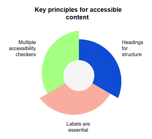
Key principles for accessible content
- Headings are for structure: Use H1-H6 tags to build a logical outline, where each heading indicates a new section of content, not for visual styling. Rely on CSS for visual emphasis.
- Labels are essential: Always use visible, correctly associated <label> elements for all form fields. Ensure the for attribute matches the input id.
- Don't trust one tool: Use multiple accessibility checkers and combine their findings with human judgment to catch a wider range of issues.
Quick checks for content authors
- Delete linked text: When you delete text that was a link in your WYSIWYG editor, quickly check the HTML/code view to ensure no empty <a></a> tags are left behind.
- Make text stand out: If you want to emphasize text visually, but that text doesn’t indicate a new section of content, use bold or italics, but only if they don't create heading tags. Another option is to ask for specific CSS utility classes from your design/dev team. Don't use a heading tag (H2, H3, etc.) for this.
- Descriptive aria-labels: If adding an aria-label to a link like "Read More," always start the aria-label content with the exact visible text of the link first.
- Form content: When providing content for forms or building them in your CMS, advocate for and ensure every single field has a clear, visible label that's correctly linked to it.
Pro-tip: Prioritization for fixes
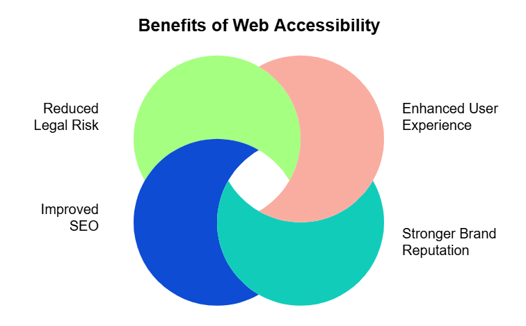
When advocating for these fixes, emphasize the broad impact:
- Enhanced user experience: Makes content usable for a much wider audience.
- Stronger brand reputation: Shows your company cares about inclusivity.
- Improved SEO: Good structure and usability can positively influence search rankings.
- Reduced legal risk: Helps meet compliance standards (ADA, EAA, etc.).
Many fixes demand little effort but deliver high impact, making them quick wins!
Taking these steps helps ensure your valuable content reaches and resonates with everyone.

Ilyssa Russ
Ilyssa leads the charge for Accessibility product marketing! All things assistive technology and inclusive digital environments. She has spent years designing and curating Learning & Development programs that scale. Teacher and writer at heart. She believes in the power of language that makes things happen.