
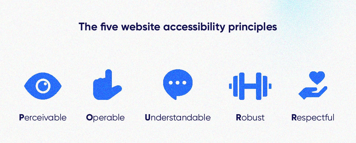
Accessibility professionals are known for making the greatest (worst?) dad joke of all time: “A good website is a POUR website.”
That’s to say a good website is one that conforms to the Web Content Accessibility Guidelines 2.1 Level AA. The core tenets of this ISO standard are perceivable, operable, understandable, and robust.
While at the AccessU conference recently hosted by Knowbility in Austin, Texas, Erica Braverman encouraged us to add another R: respect. Just as Tony the Tiger says “grrreat,” let’s add another R to the bad (oops, dad) joke: “A good website is a POURR website.”
Designing for respect
Mashable called 2019 the “year of dark mode.” Every operating system has brought us the ability to transform our devices into an energy-saving, easy-on-the-eyes, and great-for-nighttime-scrolling mode that turns backgrounds dark and text light. It adds “cool” and “wow” factors to websites and apps.
Until this conference, though, I hadn’t considered dark mode to be an issue of respect. Tori Clark challenged me in her session. Through some basic media queries and CSS 4 variables, she encouraged sites to have even more color modes: light mode (okay, that’s a designer’s default), dark mode (sure, that’s cool), and forced-colors (wait, what?).
Yep, back in Windows 95, Microsoft gave users the option of a “high-contrast mode.”
In that moment, I couldn’t believe where my brain went. I ventured into a dangerous space – one that I’m ashamed to admit – that’s sure to put me on edge whenever I hear a designer venture close to this line of thinking.
“Are you seriously asking me to design my site three times, to support three color schemes, and double the scope of work?” I thought. Then, it got worse. “How many users even use forced-colors?”
Oh dear. Have I gone to the dark side? (Now that one wasn’t meant to be a dad joke.) Should I give up my designation as an accessibility professional?
Nope. I have a newfound empathy for designers and respect for users.
Moving accessibility “left” in your processes
At Siteimprove, we advocate that teams and companies shift accessibility “left” in their processes. Despite our best efforts, accessibility isn’t usually considered fully — and especially early — enough in the process of dreaming, designing, and developing new experiences.
There are exceptional teams thinking about inclusive equality, but we accessibility-minded folks are often pushing against the grain of conventional thinking. Even the most forward-thinking design teams must pause to ensure that all personas within our ideal customer profiles will flow through a new process with ease.
Then, accessibility comes in. We ask product owners, designers, managers, and developers to do more, more, and more.
We ask more of these teams because we respect every user. We can’t respect only the majority of users, especially because people with disabilities haven’t ever held – and are unlikely to hold – a 51% market share. (A topic for another day: is the “average” user really the “majority” anyway?)
Newfound empathy for teams trying to shift left
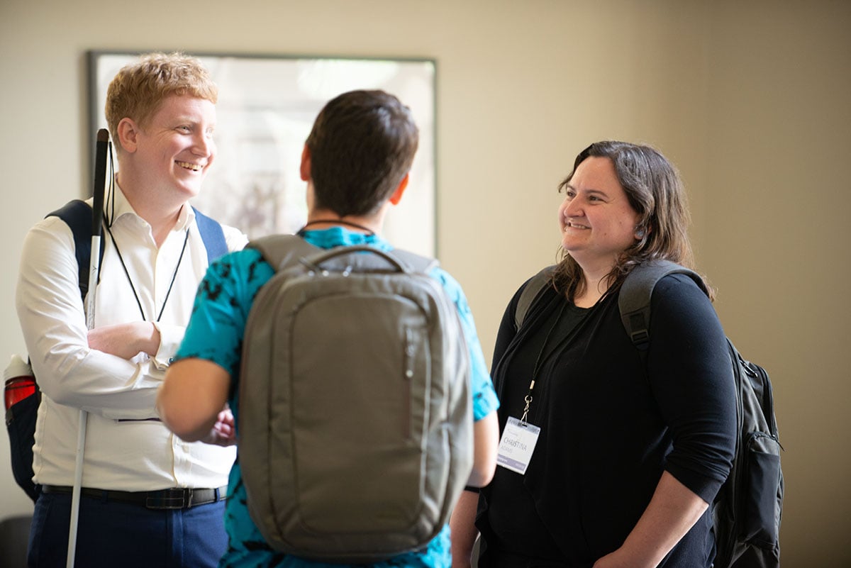
Siteimprove's Corbb O'Connor and Christina Adams at the Knowability 2022 event.
As I began to think about what it means to respect each user’s preferences, I also felt a newfound respect for the teams of whom we ask to shift their thinking left.
Every product team’s direction is ever-changing in response to market trends, feedback, and diversity. any teams focus upon a singular path to their final destination.
And to those teams I say: I feel your frustration in a way that I haven’t before.
You’re asked to build a product, and we haven’t warned you that we’ll iterate through a multitude of solutions. How many? Well, how diverse is our user base? Maybe it’s just better for everyone if we assume creativity requires no less than our constant refinement.
As interesting of an experiment as it might be, I can’t design a website that both aims to convert users and only works for those using a keyboard. I can’t design a site that has white text on a white background that’s only readable by screen-reader users if I want to make money from as many users as possible. And in a similar vein, I can’t design a site with only one- or two-color schemes. That would not be respectful.
So, I stand corrected thanks to Erica and Tori. Design for light mode, design for dark mode, and design for those using forced-colors. Users will say “wow;” the media will call your site “cool;” and I’ll empathically say: “Respect.”
Ready to create more accessible and inclusive web content?
Siteimprove Accessibility can help you create an inclusive digital presence for all.
Request a demo
Corbb O'Connor
Corbb is a former Manager of Accessibility Testing at Siteimprove where he oversaw the process from sale to delivery of WCAG-conformance audits.